The perfect pair
Some things really are better together, cheese and wine, for example, both wonderful on their own but even better together. The same works for colours, especially within the home. You may know which colour schemes you like, but not sure which ones work well together, and we know this isn’t always an easy choice to get right.
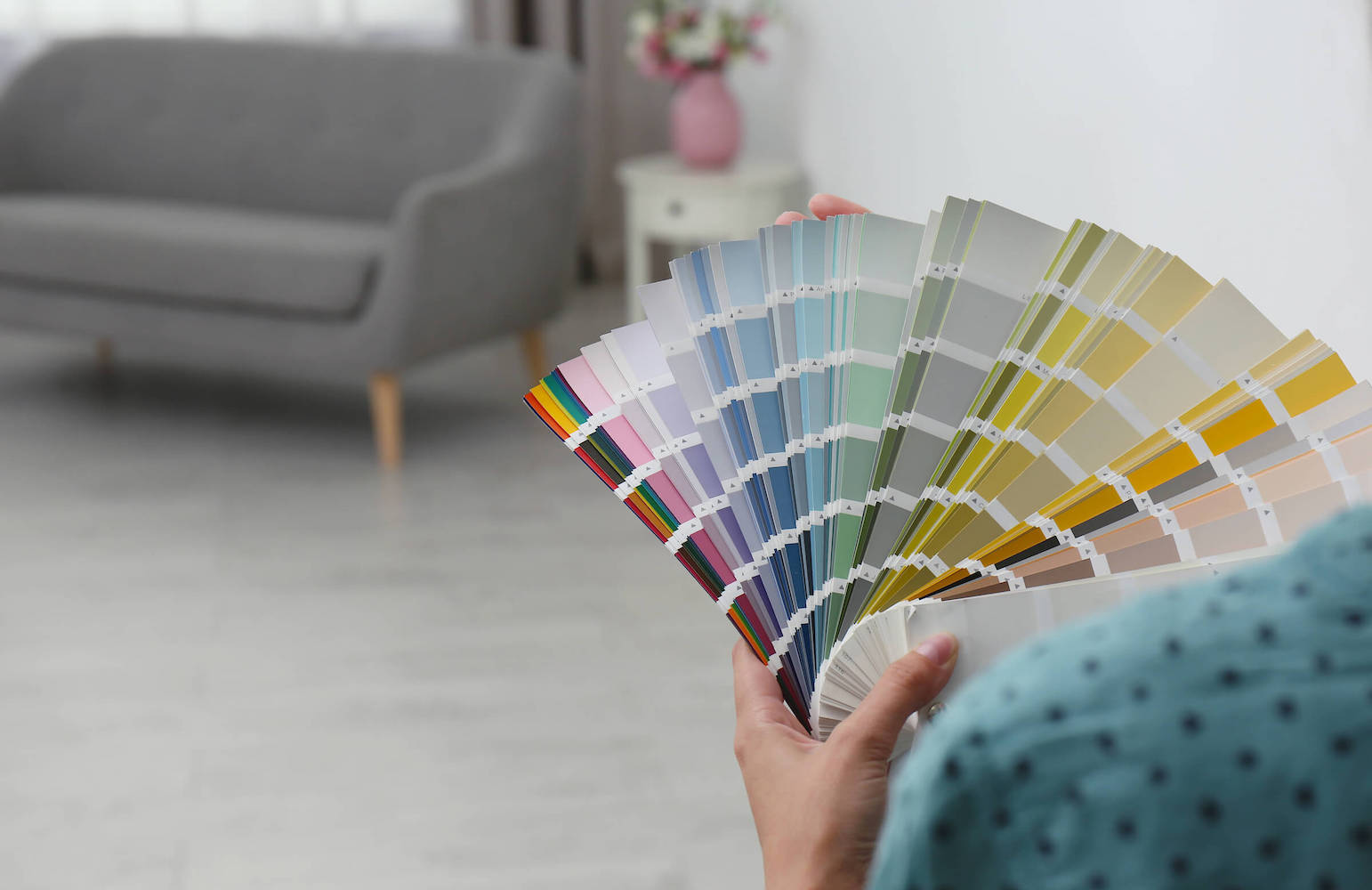
To help with any colour matching confusion you may have, our interior designers have shared some of their favourite colour matches which can be used to transform your home!
Grey and yellow – grey and yellow is a classic combination that works well in any room. Grey is a neutral colour that provides a blank canvas for you to work with, while yellow injects some cheerfulness and personality into the space. This combination creates a bright and airy feel in your home. If you’re looking for a luxury feel to a room, opt for a mustard yellow contrasted with the deep grey, whereas if you’re looking for a more relaxed and chilled-out vibe, you can opt for pastels.
Black and deep jewels – if you’re looking for something a little more dramatic, try pairing black with deep jewel tones like ruby or emerald green. The contrast between the two colours will make a stunning statement in any room. Just be sure to use these colours sparingly, as too much can make the space feel heavy and dark.
Navy blue & white – for a more traditional look, consider pairing navy blue with white. This timeless combination works well in any room and can be easily dressed up or down depending on your needs. Navy blue is also a great option if you want to add a pop of colour to a room without going over the top.
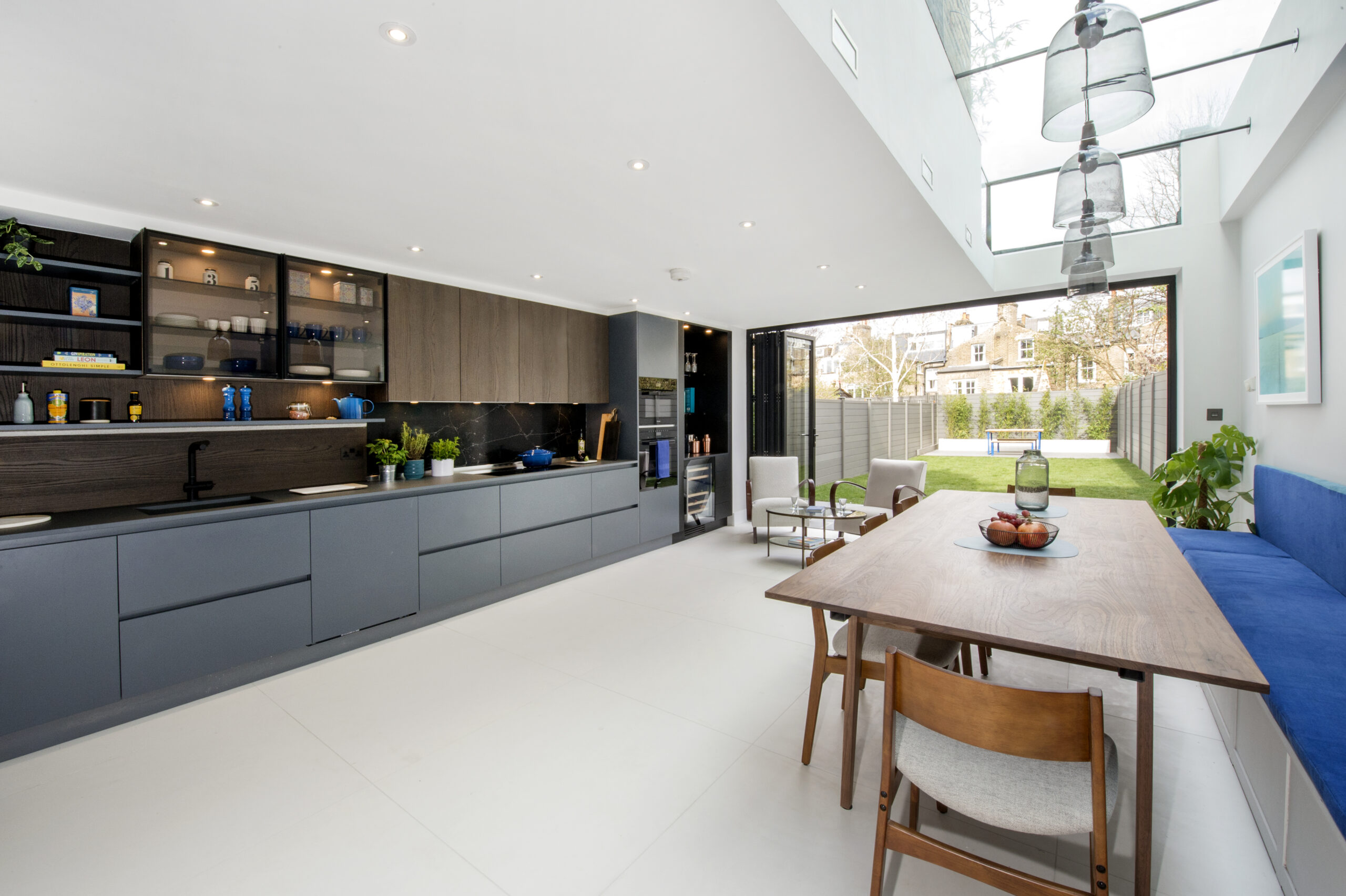
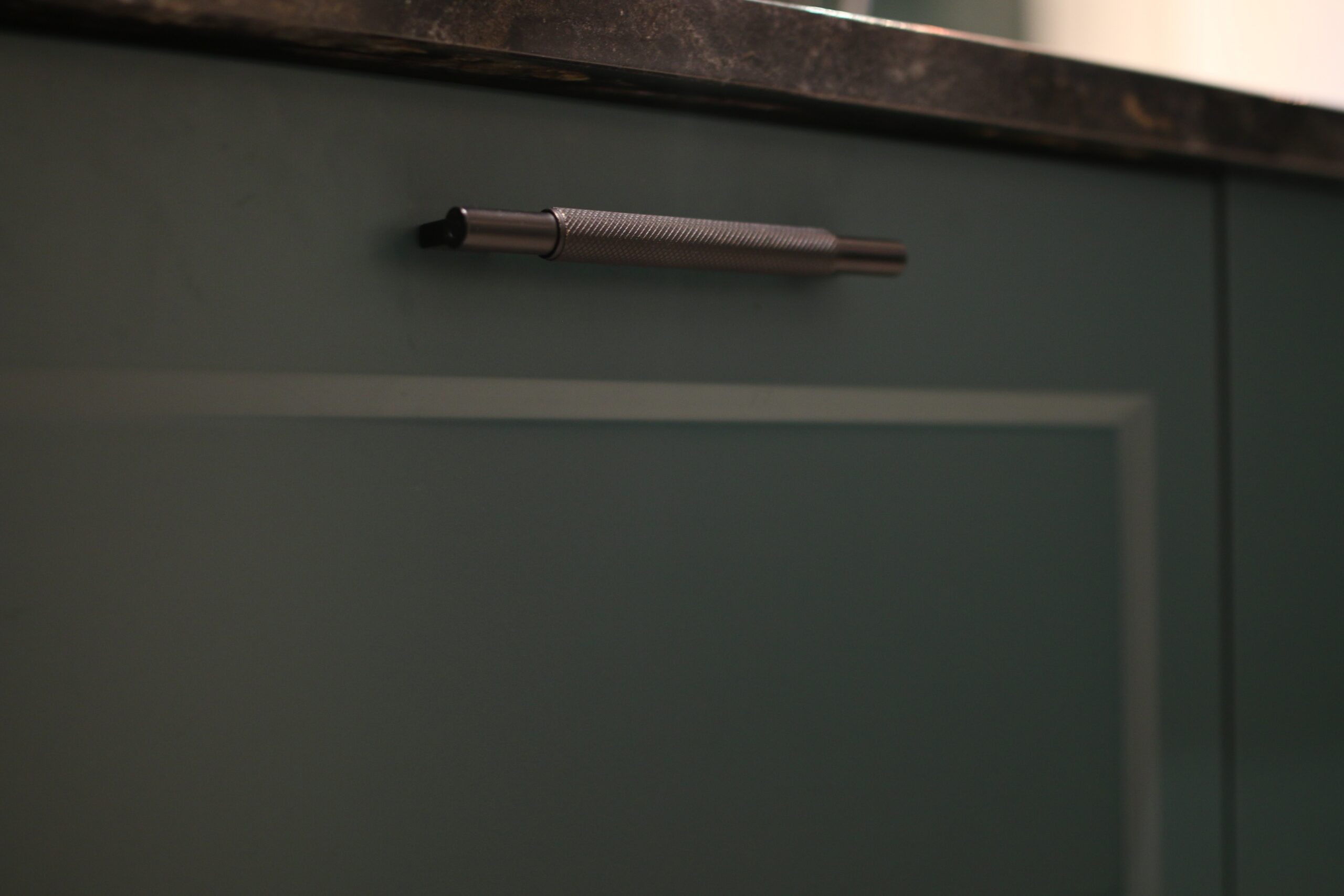
Monochrome – the great thing about working with a monochrome colour palette is that they are guaranteed to be suited, as they are coming from the same family of colours. You can also have a lot of fun with monochrome colours and experiment with the various tones. One piece of advice for decorating with monochromatic colours is to ensure that you really use the different textures and furniture within the room, and not just focus on the walls. If you’re using the same colours throughout a space, it can easily look flat if not done correctly.
Baby pink and Turquoise – this Miami-style Art Deco combination can be eccentric, classy and welcoming all at the same. A lot of people might be frightened to explore these two colours together as they are often seen as complete opposites, but in terms of the colour wheel, they aren’t opposites at all.
Whatever colours you choose, be sure to test them out before making any final decisions. Paint samples are available at most shops, and they’re a great way to see how the colours will look in your space before committing to them. With a little planning, you can create the perfect colour palette for your home.
Company Bio
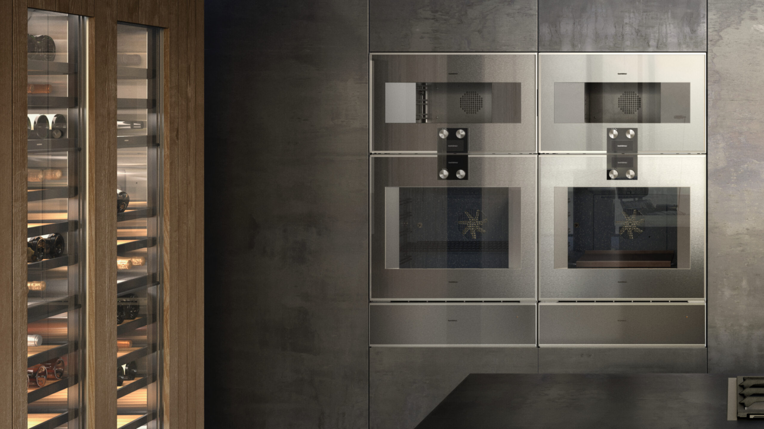
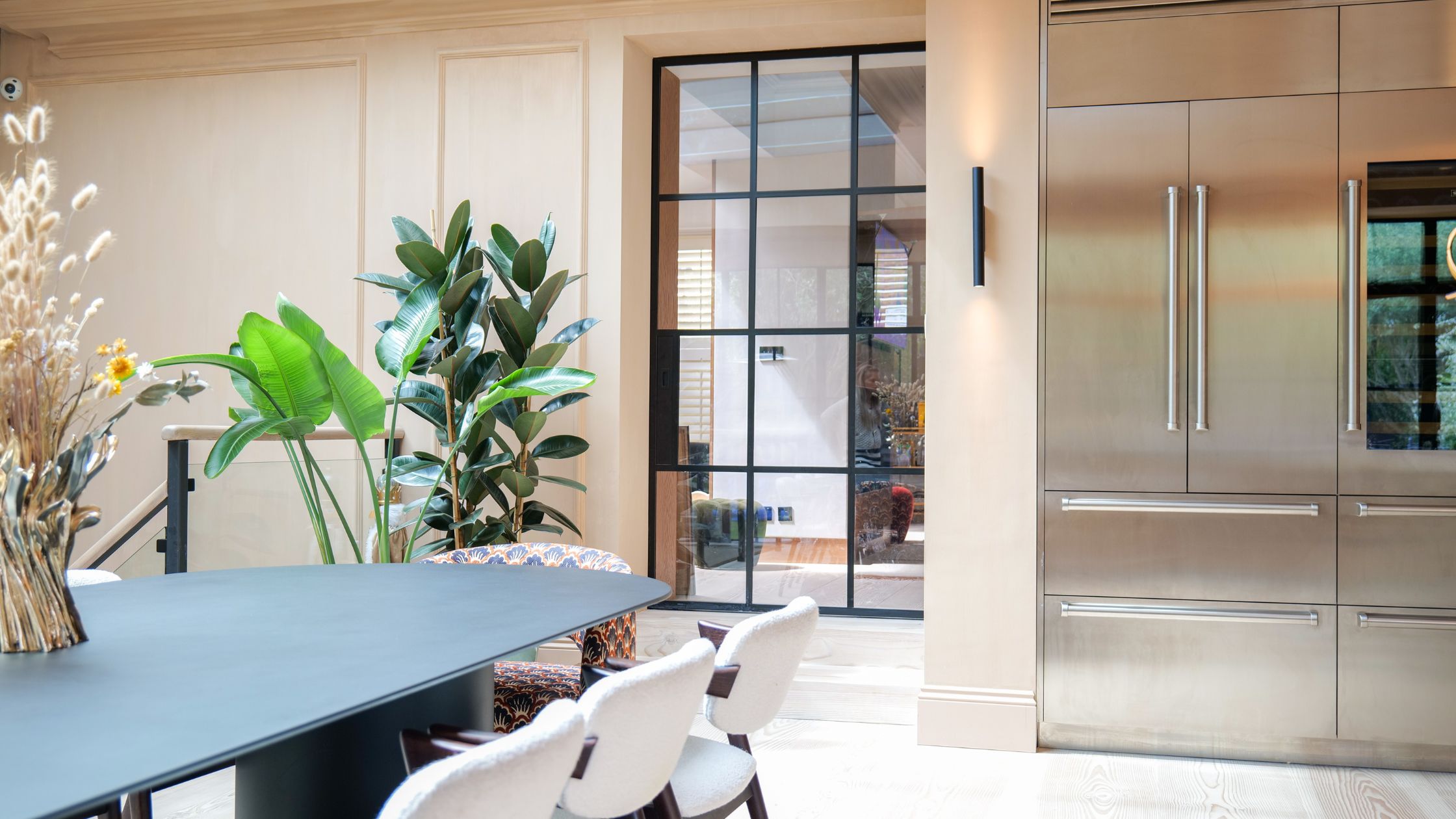
Hi-Spec Design is a family run interior design agency based in Chelsea, South West London. We specialise in bespoke kitchens and work with some of the best appliance manufacturers across Europe, this company is remembered by its customers for its unique and luxurious designs. Read more about our story here.